Checkbox Group
The Checkbox Group cell type allows you to create multiple checkboxes. It can be in both vertical and horizontal format.
Note: If you want to save the checkbox group data in a table, set the destination field to “text type”. This is because the value of the selection items such as “Item 1, Item 2, Item 3” separated by commas is the value stored in the table field.
Steps to create a checkbox group with cell type:
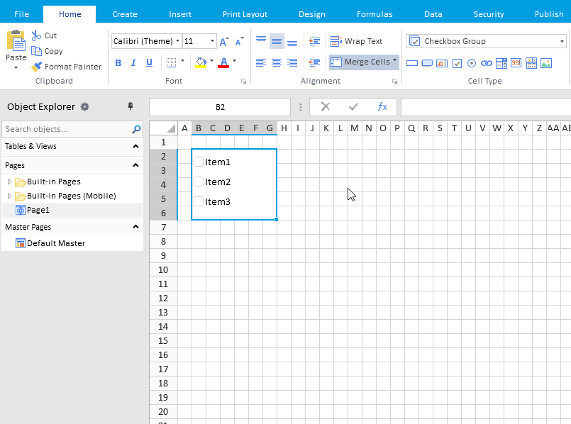
- Select a cell and go to Cell Type drop-down list.
- Select Checkbox Group cell type.
- Multiple checkboxes will be created in the selected cell to form a checkbox group.
- You can place the checkboxes horizontally or vertically, merge cells and adjust cell widths. Click on the Cell Type tab at the bottom of the right pane for checkbox group settings. The controls are as follows:
| Controls | Description |
|---|---|
| Commands.. | Sets the command to be executed when the value changes. See the command for more information. |
| Set UI Permissions.. | Allows you to do enable/ visible/editable settings. |
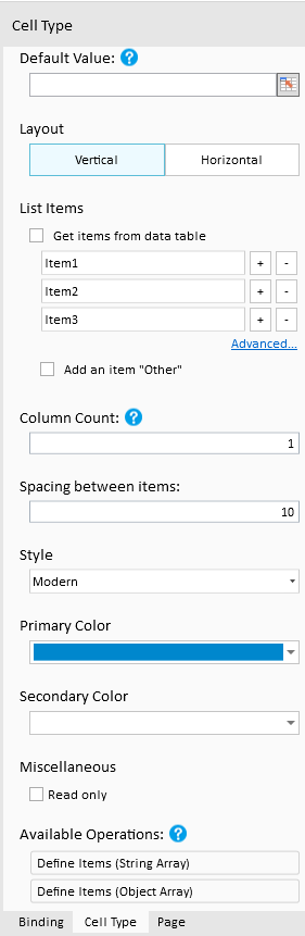
| Layout | Specifies the placement direction of the checkboxes- Vertical/Horizontal. 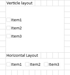 |
| List item | Specifies the text to be displayed on the right side of the checkbox. Default text is Item 1, Item 2, ..so on - If you uncheck Get items from data table, you need to manually set the text. - You can increase or decrease checkbox items with + and - 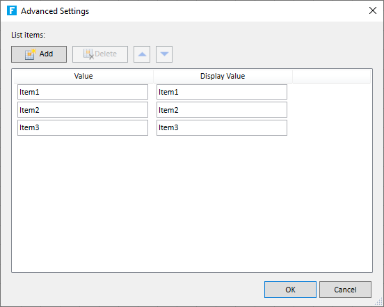 -Click on Advanced.. to specify the value to be displayed in each checkbox i.e. Display Value and the value used in formulas and data concatenation i.e. Value separately. If you check Get items from data table, you can get the value to be displayed and the value from the field of the table. When the data in the table changes, it is automatically reflected in the list items. 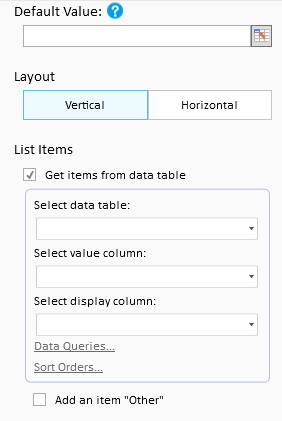 You can set query conditions by Data Query. Note: You cannot use Query Criteria in List View. By clicking Sort Order, you can set the conditions for how to sort and display at runtime. –> Check Add an item “Other” to display Other as an item and allow the user to enter a value in the text box. You can specify the width of the text box for input in pixels. The default value is 100. It cannot be used when Style is Toggle or Button. If you use related fields, the table associations must be between tables in the same database and in the same instance. For example, if you have an association between Forguncy’s internal database and an external database such as SQL Server or Oracle Database, or if the databases are different and the instances are not the same between SQL Servers, the related fields cannot be used. |
| Same width for all items | This setting is displayed for Horizontal layout. If checked, all items will be displayed with the same width as the item with the longest string, regardless of the length of the item string. Note: This setting is reflected only at run time, and there is no change in the display at design time. This item cannot be set in the celltype on the list view. |
| Column Count | This setting is displayed for Vertical layouts. The items are automatically wrapped and displayed so that the number of columns matches with this setting value. Note: This setting is reflected only at run time, and there is no change in the display at design time. This item cannot be set in the celltype on the list view. |
| Margin between items | Specifies the margin between checkboxes (in pixels). |
| Style | Allows you to choose from four options: System, Modern, Toggle, and Button. The default value is Modern. |
| Primary Color | Specifies the fill color of the checkbox. It is not applicable for System type style. |
| Secondary Color | Specifies the color of the tick mark. It is not applicable for System type style. |
| Read only | If checked, user cannot make changes to the state of the checkbox i.e. checkbox will appear in non-editable format. |